HBCU Enrollment [Data Visualization]
By Oliver C. Stringham in tidy-tuesday data-visualization r
February 2, 2021
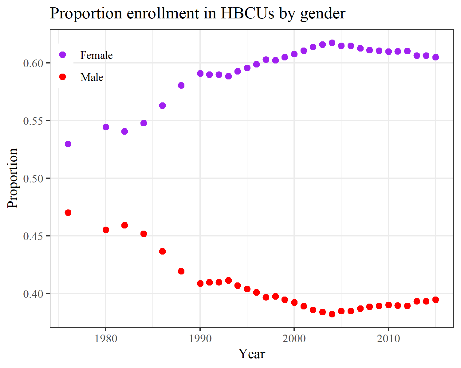
This week I explored the TidyTuesday dataset of the week: Fall enrollment in degree-granting historically Black colleges and universities (HBCU). I plotted the proportion of student enrollment by gender over time. Plot made in R with ggplot2. Code can be found below plot.
Read more about the gender gap at HBCUs here. Please consider donating to HBCUs, to help fund student’s financial assistance programs: https://thehbcufoundation.org/donate/.
R Code
library(tidyverse)


#  https://github.com/rfordatascience/tidytuesday/blob/master/data/2021/2021-01-26/readme.md
hbcu_all <- readr::read_csv('https://raw.githubusercontent.com/rfordatascience/tidytuesday/master/data/2021/2021-02-02/hbcu_all.csv')

df =
hbcu_all %>%
  mutate(
         # p_4yr = `4-year - Public`/`Total enrollment`,
         # p_2yr = `2-year - Private`/`Total enrollment`,
         p_male = Males/`Total enrollment`,
         p_female = Females/`Total enrollment`,
         p_public = `Total - Public`/`Total enrollment`,
         p_private = `Total - Private`/`Total enrollment`) %>%
  select(Year, p_male:p_private) %>%
  pivot_longer(cols = p_male:p_private)

p =
  df %>%
  filter(name %in% c("p_female", "p_male")) %>%
  ggplot(aes(x = Year)) +
  geom_point(size = 2, aes(y = value, group = name, color = name)) +
  labs(y = "Proportion", x = "Year", color = "",
       title = "Proportion enrollment in HBCUs by gender") +
  scale_color_manual(values = c("purple", "red"), labels = c("Female", "Male")) +
  scale_y_continuous(breaks = scales::pretty_breaks()) +
  # theme_minimal() +
  theme_bw() +
  theme(legend.position = c(0.08,0.91),
        legend.background = element_blank(),
        legend.box.background = element_blank(),
        panel.grid.minor.y = element_blank(),
        text=element_text(family="serif"))

p

ggsave(p, filename = 'hbcu_gender.png',
       width = 5, height = 4)