Add your (R) plots and maps to Wikipedia!
By Oliver C. Stringham in data-visualization r gis
March 15, 2022
Introduction
Wikipedia is an amazing resource and we should contribute where we can! There are plenty of opportunities to add new plots or update existing plots.
One such opportunity, that I explore below, is the 2020 US census, which now is publicly available. There are many new maps and other data visualizations that can be made for Wikipedia articles using this dataset. Note, the 2020 Census was found to undercount communities of color 1. Thus, care should be taken to address/acknowledge this bias when communicating visualizations with this data.
Some tips for making Wiki friendly plots
As a first step, check out Wikipedia’s own article on “How to create charts for Wikipedia articles”.
Also, I recommend passing your plots through the Color Blindness Simulator. This can ensure your color scales are interpretable by the largest possible population of people. Also, passing existing plots through the Color Blindness Simulator can be a good way to see if the plot needs to be updated.
Process of submitting plots to Wikipedia
Gone is the time where regular people can directly edit Wikipedia articles. For most articles, changes are suggested and then article Admins can either approve, deny, or ask for more information. To suggest changes, use the “Talk” section of an article (upper left of an article, screenshot below), where the rules on how to suggest updates are outlined. Note, these rules can differ by article.

What did I do?
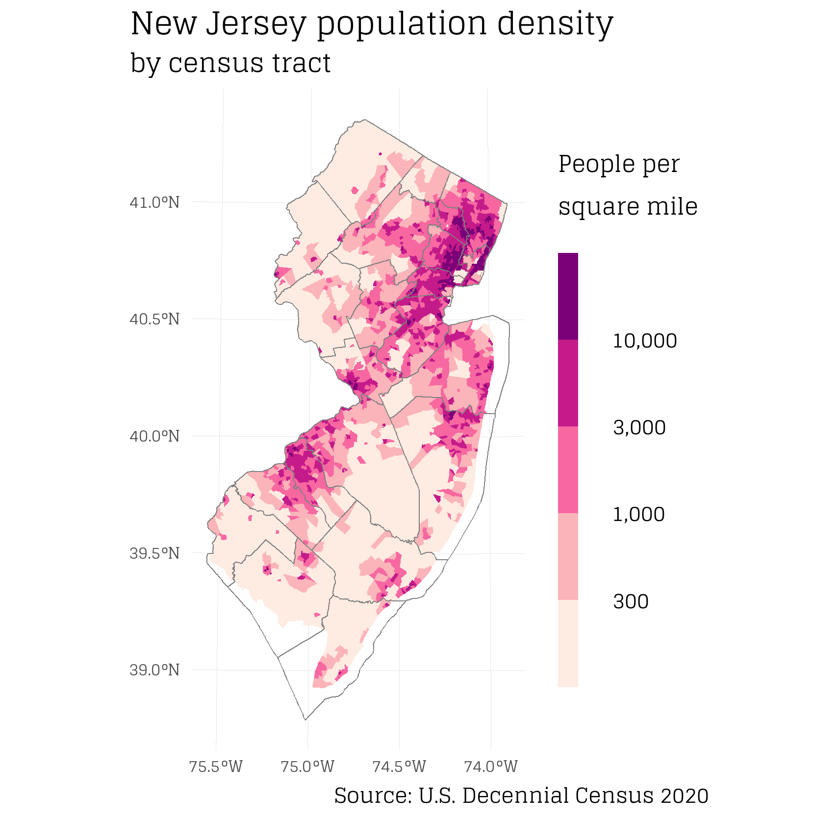
I created a population density map of New Jersey 2 using the new 2020 census data. I believe it was a good contribution because (i) the previous map used 2010 census data and (ii) I switched to a color-blind friendly color scale. I suggested this new map on the Talk section 3 of the New Jersey Wikipedia article and then about a week later an Admin accepted it on the official NJ Wikipedia article 4. See below for R code to re-create map.

R Code
library(sf)
library(units)
library(dplyr)
library(stringr)
library(ggplot2)
library(showtext)

# Load in data

## Load in census tract boundary shapes
## from https://www.census.gov/cgi-bin/geo/shapefiles/index.php?year=2020&layergroup=Census+Tracts
tract_sf = read_sf("~/../Downloads/tl_2020_34_tract/tl_2020_34_tract.shp")

## Load in census data
## from https://data.census.gov/cedsci/, NJ all census tracts, 2020, Decennial Census, P1 | Race
## https://data.census.gov/cedsci/table?t=Populations%20and%20People&g=0400000US34%241400000&y=2020&tid=DECENNIALPL2020.P1
tract_data = read.csv("~/../Downloads/DECENNIALPL2020.P1_2022-02-14T053238/DECENNIALPL2020.P1_data_with_overlays_2022-02-14T052927.csv")

## Load in NJ County boundaries
## from https://www.census.gov/cgi-bin/geo/shapefiles/index.php?year=2020&layergroup=Counties+%28and+equivalent%29
counties = read_sf("~/../Downloads/tl_2020_us_county/tl_2020_us_county.shp")
### filter for only NJ
counties = counties %>% filter(STATEFP == 34)


# Join tract data with tract spatial file

## first make keys (shared column) the same so that join can happen
tract_data = tract_data %>% mutate(geoid = str_extract(GEO_ID, "\\d+$"))

## join
tract = tract_sf %>%
  left_join(tract_data, by = c("GEOID" = "geoid"))


# Convert all data fields to numeric
tract =
  tract %>%
  mutate_at(vars(starts_with("P1")), as.numeric)


# Calculate population per area

## calculate area

### Project spatial file to known units
tract_proj = tract %>% st_transform(3424)

### calculate area
tract_proj$area = st_area(tract_proj)

### convert to sq mile
tract_proj$area_sqmi = units::set_units(tract_proj$area, mi^2)

## calculate pop per sq mile
tract_proj = tract_proj %>%
  mutate(pop_sqmi = units::drop_units(P1_001N/area_sqmi))

## for all data columns, calculate: % of total population, # density (not used)
tract_proj = tract_proj %>%
  mutate_at(vars(starts_with("P1")), list(prop = ~./P1_001N)) %>% # , .names = "{col}_prop"
  mutate_at(vars(c(starts_with("P1")) & !ends_with("prop")), list(p_sq_mi = ~units::drop_units(./area_sqmi)))

### test that it worked ok
sum(tract_proj$pop_sqmi == tract_proj$P1_001N_p_sq_mi) == nrow(tract_proj)


# Map it

## get font
font_add_google(name = "Glegoo", family = "glegoo")
showtext_auto()


## Create plot
p =
  tract_proj %>%
  filter(pop_sqmi > 0) %>%
  ggplot() +
  geom_sf(aes(fill = pop_sqmi), color = NA) +
  scale_fill_fermenter(direction = 1,
                       palette = "RdPu",
                       breaks = c(300, 1000, 3000, 10000),
                       labels = scales::comma) +
  geom_sf(data = counties, fill = NA, color = "gray50", size= 0.25) +
  labs(fill = "People per\nsquare mile",
       caption = "Source: U.S. Decennial Census 2020",
       title = "New Jersey population density",
       subtitle = "by census tract") +
  theme_minimal() +
  theme(text = element_text(family = "glegoo"),
        plot.title = element_text(size = 40),
        legend.title = element_text(size = 35, lineheight = 0.5),
        legend.text = element_text(size = 32, lineheight = 0),
        legend.key.height = unit(1.5, units = "cm"),
        legend.key.width = unit(0.35, units = "cm"),
        # legend.text.align = -0.5,
        axis.text = element_text(size = 25),
        panel.grid = element_line(color = "gray90", size = 0.01),
        plot.background = element_rect(fill="white", color = NA),
        plot.caption.position = "plot",
        plot.title.position = "plot",
        legend.position = "right")

## View plot, note the text looks too big in RStudio Plot viewer but exports fine
p

# Export map
ggsave(plot = p, file = "~/../Downloads/nj_pop_dens.png", dpi = 300)