Data Visualization Gallery

A compilation of my data visualizations

The Bachelor (TV Show) [Data Visualization]

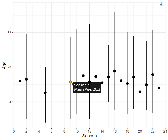
For this #TidyTuesday, I plotted the age of contestants on The Bachelor across >20 seasons. There was no significant trend in the age of contestants over time. The average age is between 25 and 27 with some variation from 21 to 34.

January 31, 2021

Tate Art [Data Visualization]

#TidyTuesday dataset of the week is the art collection of Tate Art Museum. I made a visual of the number of acquisitions made by Tate by decade taking into account what decade the art was created.

January 15, 2021

Toronto Homeless Shelters [Data Visualization]

The #TidyTuesday data of the week come from #OpenDataToronto on homeless shelters in Toronto and their occupancy from 2017 - 2019. I took a try at web map with help from #rstats and Leafletjs.

January 12, 2020

Washington Hiking [Data Visualization]

#TidyTuesday of the week for Washington Hiking data from @ WTA_hikers. You’re looking at the most common words used to describe parks in each region of WA (word clouds) and the most unique words used to describe each region (tf-idf). View code here.