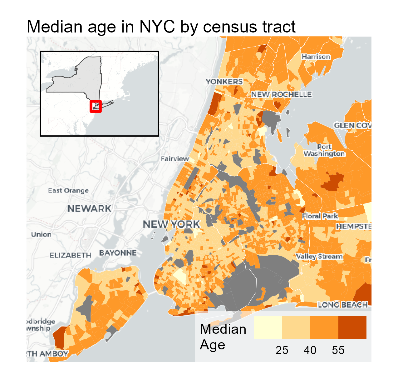
Mapping Your Data with ggplot2 in R with Basemaps and Insets
How to make polished, publication-ready maps in ggplot2, basemaps, and cowplot for insets.
Featuring data science tutorials, modelling, and visualization.
Written by Oliver C. Stringham
How to make polished, publication-ready maps in ggplot2, basemaps, and cowplot for insets.
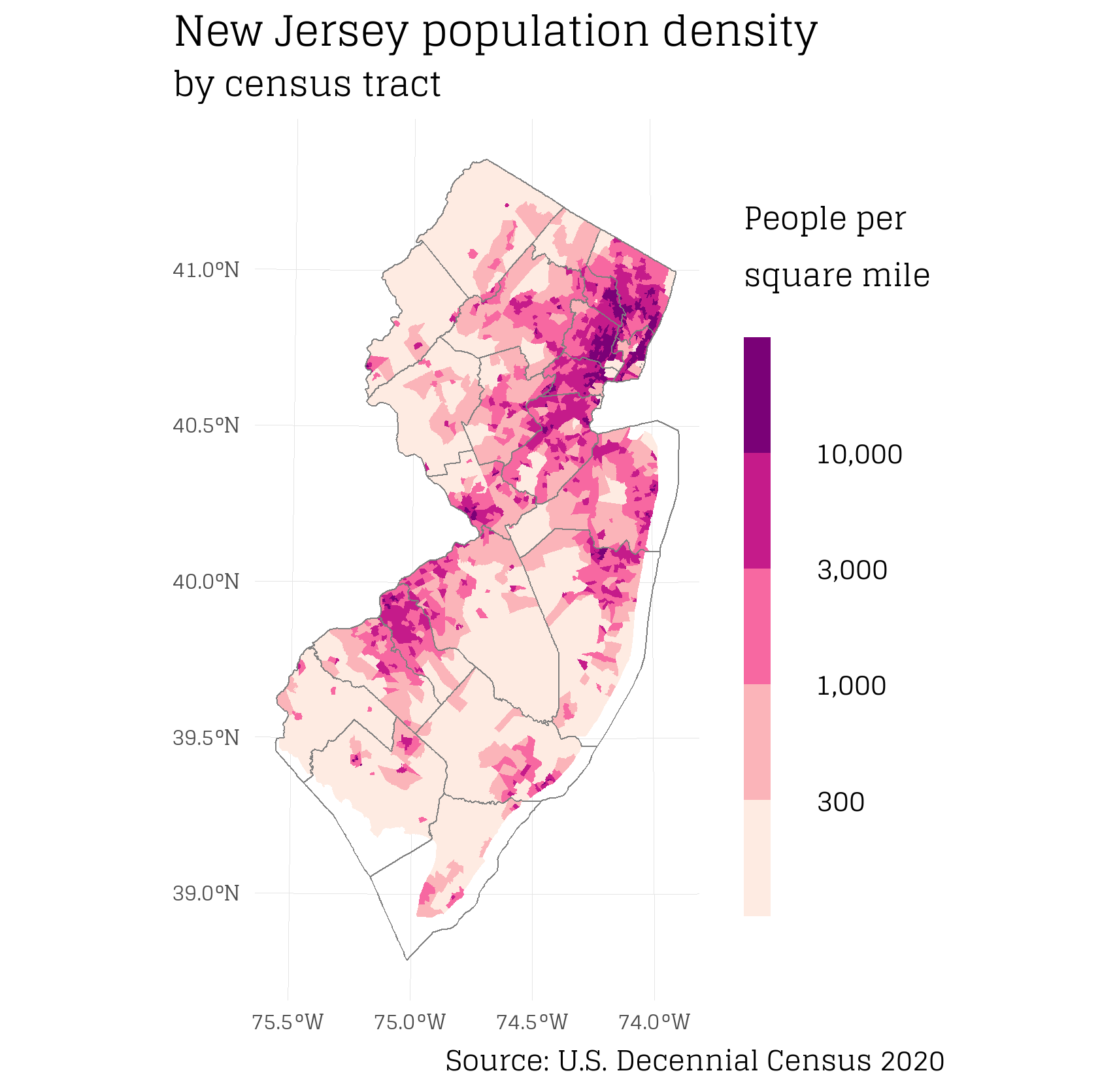
There are plenty of opportunities to submit new (R) plots to Wikipedia. Let’s do it!
In this tutorial I will show how to set up PostgreSQL with PostGIS to run spatial queries in R. I cover installation of PostgresSQL, creating schemas, saving data to tables, connecting from R, and running spatial queries.
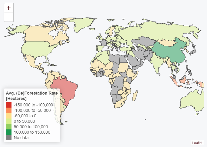
Interactive map of of global deforestation rates using Leaflet and R.
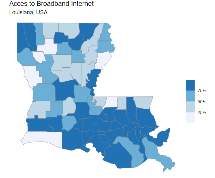
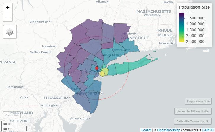
Interactive map of broadband internet access across Louisiana, USA