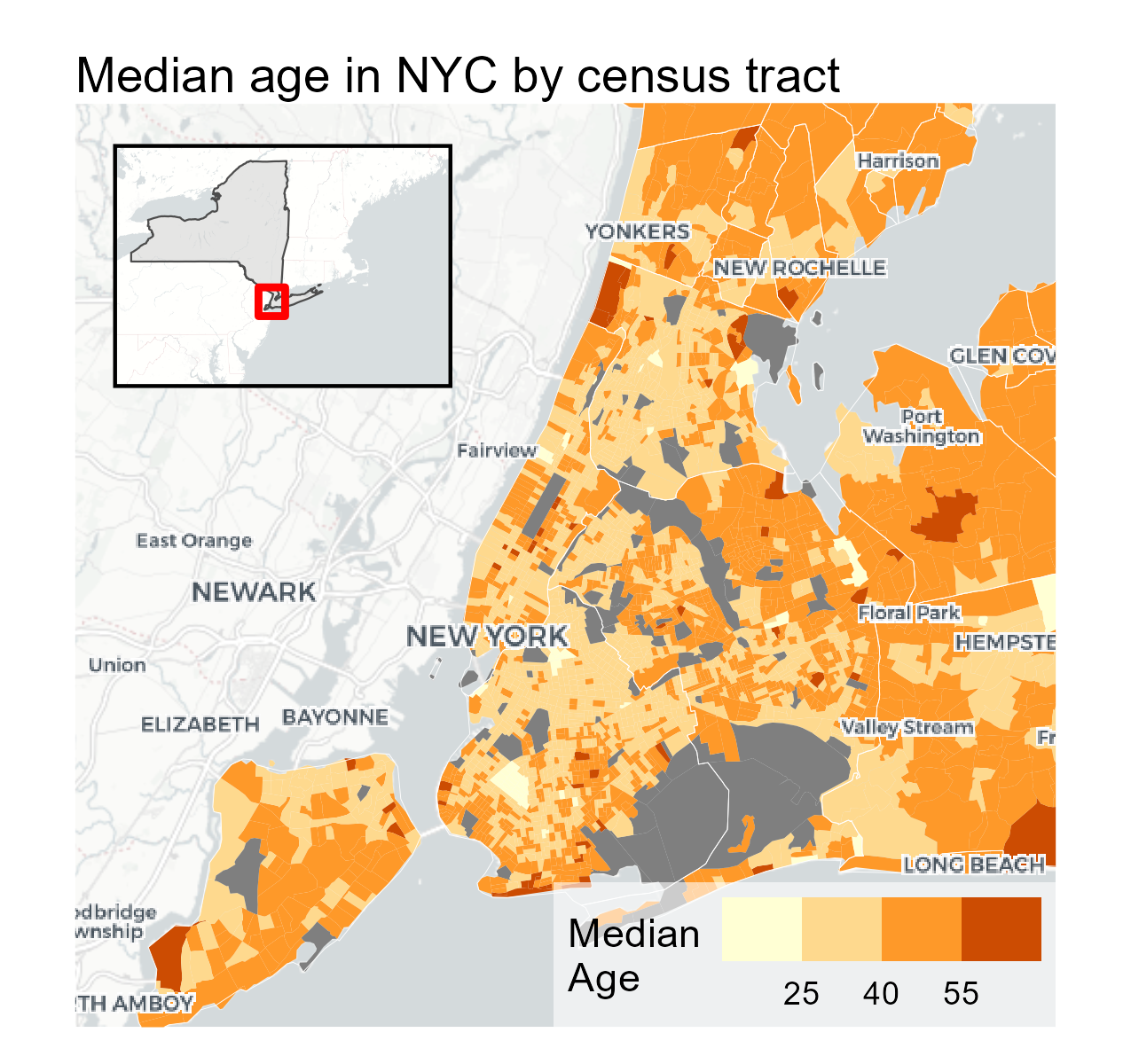
Mapping Your Data with ggplot2 in R with Basemaps and Insets
How to make polished, publication-ready maps in ggplot2, basemaps, and cowplot for insets.
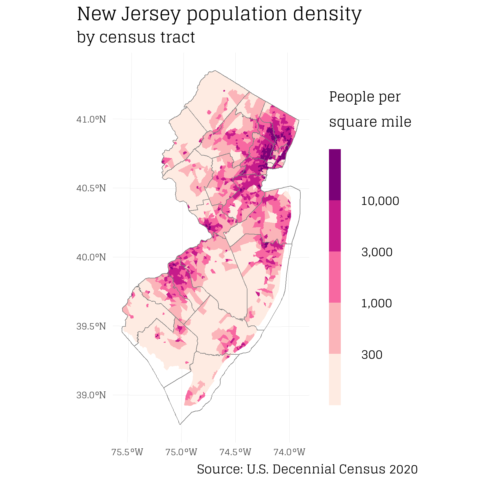
A compilation of my data visualizations
How to make polished, publication-ready maps in ggplot2, basemaps, and cowplot for insets.
There are plenty of opportunities to submit new (R) plots to Wikipedia. Let’s do it!
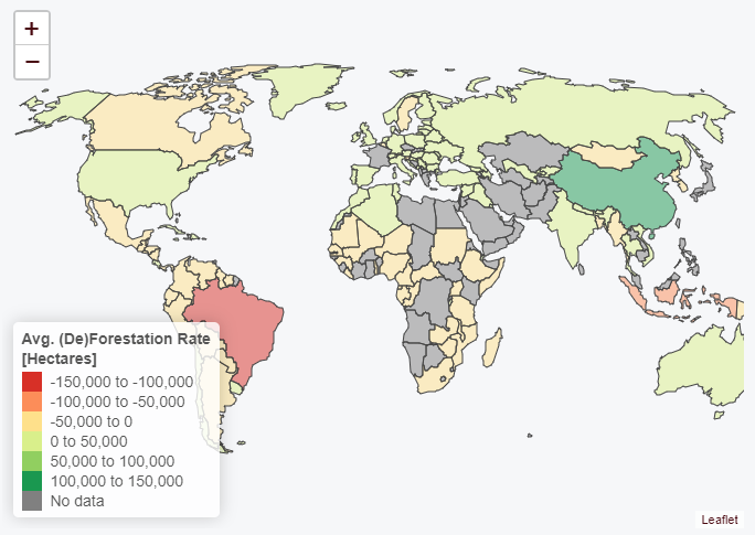
Interactive map of of global deforestation rates using Leaflet and R.
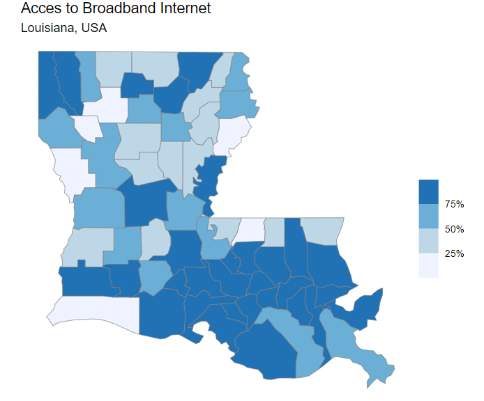
Interactive map of broadband internet access across Louisiana, USA
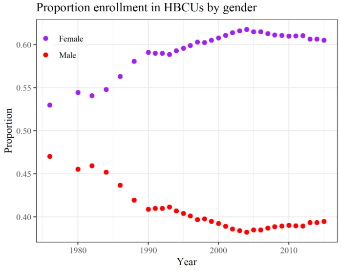
This week I explored the TidyTuesday dataset of the week: Fall enrollment in degree-granting historically Black colleges and universities (HBCU). I plotted the proportion of student enrollment by gender over time. Plot made in R with ggplot2.