Broadband Access [Data Visualization]
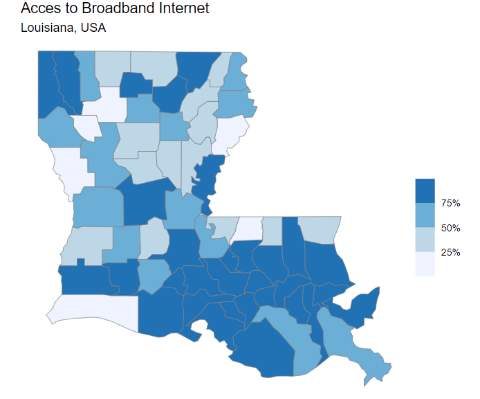
Interactive map of broadband internet access across Louisiana, USA
Featuring data science tutorials, modelling, and visualization.
Written by Oliver C. Stringham
Interactive map of broadband internet access across Louisiana, USA
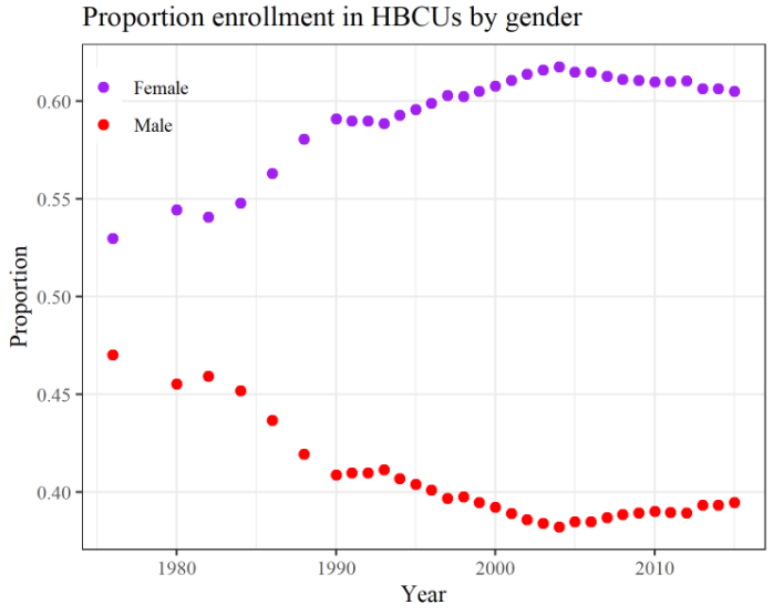
This week I explored the TidyTuesday dataset of the week: Fall enrollment in degree-granting historically Black colleges and universities (HBCU). I plotted the proportion of student enrollment by gender over time. Plot made in R with ggplot2.
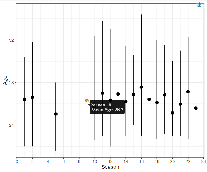
For this #TidyTuesday, I plotted the age of contestants on The Bachelor across >20 seasons. There was no significant trend in the age of contestants over time. The average age is between 25 and 27 with some variation from 21 to 34.
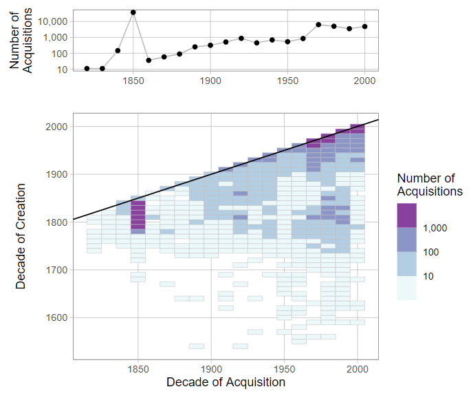
#TidyTuesday dataset of the week is the art collection of Tate Art Museum. I made a visual of the number of acquisitions made by Tate by decade taking into account what decade the art was created.
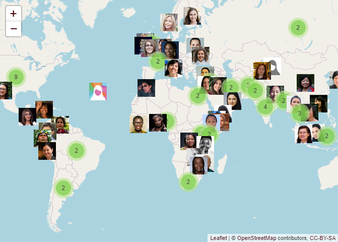
#TidyTuesday dataset of the week is the BBC Women of 2020! I made an interactive web map using #rstats and LeafletJS